Main idea: Visualization helps draw out the story of data.
Things I found interesting, but not necessarily that I agree with.
Tara has a wiki here and her preso is here. For full disclosure's sake, I'll just point out that she's a friend of mine. This may bias me. On the other hand, my friends would tell you I'm not one for empty compliments.
Since she's shared all of her stuff I'm not going to recap very much and to save your eyes I'm not going to italicize. You'll just have to figure out what's me and what's her. (Hint: If it sounds smart, it's Tara.)
It was easily the prettiest set of visuals of the weekend and the pdf version doesn't do it justice. On the pdf, some of the slide transitions were lost or smooshed together. On page 2, in the left column, the sample health and academic reports had makeovers but the pdf hides them behind the original.
Tara had three rules for good data visualization.
- Story
- Interactive
- Glanceability
Interactive was about surprise and emotional pull rather than "I can click and drag stuff."
Glanceability, which is a quite awesome made up word, was about being able to take in the meaning quickly.
Tara demoed a few tools (motion charts, fusion, mapalist) and showed her sample report card. All these links come from the wiki page.
One thing I hadn't seen before was she took all the teacher comments off student reports in one school and put them into a word cloud. Then she contrasted them with a word cloud generated based on what the teachers thought was important. In a stunning upset, there may be an actual use for wordle and the like.
The only one of the the three elements I might disagree with, or at least wish to clarify, is glanceability. I think this one comes down to purpose. In a presentation, report card, or any other type of purposeful summary I'd want glanceability. I want to be able to quickly survey the data and see what are important. On the other hand, sometimes I want information density and the chance to sit there and really work through the relationships. There's an xkcd comic showing character interactions that is pretty awesome but incredibly confusing until you stare at it awhile. Click to embiggen:
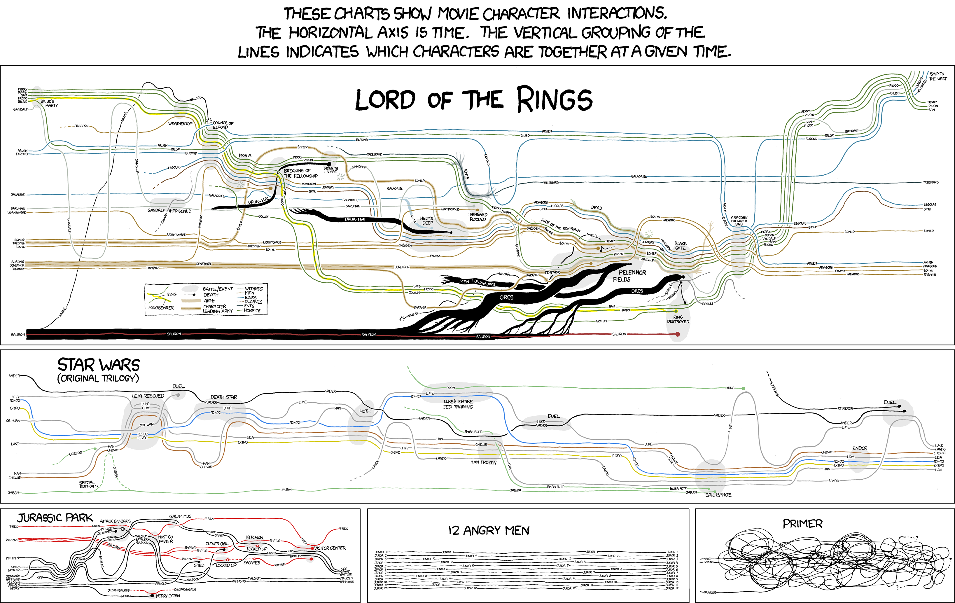
It is very information dense but I'm not sure you could take anything meaningful out of it quickly.
There's also this data viz of Napolean's army in a Russia campaign that Tufte made famous:
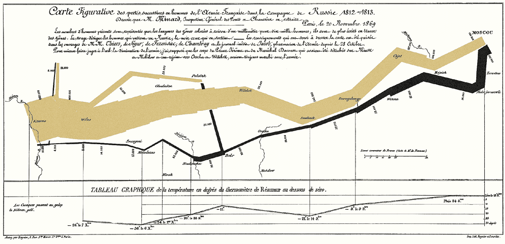
It contains the size of the army, the path, a time line and temperatures. It certainly is information dense. It also is certainly an improvement in terms of story and interactivity over a table of numbers. On the other hand, I wouldn't call it glanceable. I'd argue that the amount of glanceability should directly relate to how strongly you wish to communicate a specific message. Tara may have mentioned this but it was 8 a.m. on Monday morning so all my synapses weren't firing at full capacity.
Now, in my typical style, I will boost my word count by talking about something tangentially related!
For awhile now I've been interested in this idea of district and school dashboards. Stephen Few wrote a book with some nice examples, but business based. I'd love to do something like this, but less ugly. Every school and every district should be making our goals transparent and public. And before you freak out about reducing kids to data points and all that, notice the district is also tracking things like the percent of kids enrolled in extracurricular programs. Most districts keep this data. They just hide it or they don't aggregate it. A good data visualization can keep the important stuff front and center. Now if I could only get Tara down to San Jose.....
Takeaway: Data visualization can help the story come out. Keep purpose in mind and design accordingly.
Wrapping up on the notes. One more session to definitely blog (John Hattie!). Maybe two if I can pull enough out of my last session. Thanks for staying with me.